PC Press is a small independent book publisher specialising in books about neo-folk and industrial music.

The website functions firstly as a shop, but also as a source of information about the artists and writers.
Woocommerce was used for the shop, which has a shopping cart, discount codes, complex shipping rules and related products displayed underneath each product.
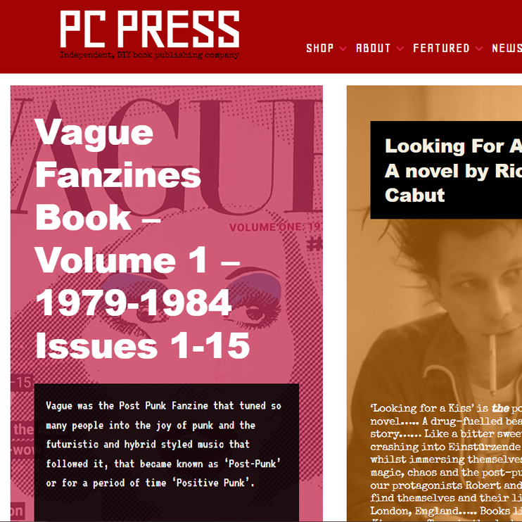
I designed the first iteration of the PC-Press website to emulate photocopied fanzines of the post-punk era, with distressed typewriter fonts and a rusty metallic background image as a reference to industrial music.
But the publishing company has expanded to cover wider forms of music, so the design was starting to feel like a constraint on the new material. We tried out a lot of design ideas, before agreeing on a brand new look, based on The Face and ID magazines from the 1980s.
The Face was ground-breaking at the time. The lead designer Neville Brody broke the rules of publishing with his use of extremely bold fonts, using them as design elements. He would use illegible fonts, fonts leaking across images and unreadable vibrant colour combinations. We felt that his iconoclastic punk approach to design would suit the new range of books that PC Press are currently producing.


So the new PC Press website landing pages use clashing colours, ultra bold or illegible fonts and very bold images, whilst retaining the essential functionality of the shop and clear navigation. The site is designed to make an equal visual impression on mobiles, since most visitors are accessing the website by mobile now.

The stark and simple logo design references the Bauhaus and Russian Constructionist art movements, which is very relevant to the bands that PC Press has written about.
Visit pc-press.co.uk

