It seems we can’t find what you’re looking for. Perhaps searching can help.

Web design. Illustration & Graphic Design
Web design. Illustration & Graphic Design
It seems we can’t find what you’re looking for. Perhaps searching can help.
![]() The Haddocks` Rest website functions both as a brochure to advertise a Welsh holiday cottage, and also as a booking site using an embedded booking form from Just Booking.
The Haddocks` Rest website functions both as a brochure to advertise a Welsh holiday cottage, and also as a booking site using an embedded booking form from Just Booking.
A simple and contemporary design showcases the beautiful photography of the cottage and village of St Davids.
An embedded map shows the location in Google Business directory and a simple contact form makes it easy for potential customers to make enquiries.
Most of the content was kept to the home page for simplicity. The site also has a blog section for the owner to post galleries and articles of interest, such as local walks or recommended dog-friendly pubs.
Visit the Haddocks` Rest website
 A clean, contemporary design with lots of white space to showcase the professional photography of Tim Mossford with a minimum of clutter or distraction.
Most of the work went into creating tailored solutions, such as enabling the galleries to be triggered by a single image, which open a popup with thumbnails to keep all the content on a single home page.
Subtle animations such as automatic scrolling, make this outwardly simple design subtly dynamic. A mosaic gallery showcases the photographer’s featured work in a compact space without cropping the images.

The logo design was based on the shape photographers make with their hands when seeing how a view will look framed.
Visit mossfordphoto.co.uk


JoJo`s Nails & Beauty is a brochure site, advertising their beauty salon treatment and beautician training workshops.
The customised theme style is based on flat design, using the brand colours taken from the logo, together with light feminine fonts.
The home page has prominent visual links to the most important parts of the site: training and salon treatments.
Each training course listed has a contact form at the bottom of the page to make it easier for customers to enquire about joining the training courses.
The reviews section has selected embedded reviews from their Facebook page, whilst the sidebar automatically displays the most recent Facebook reviews. Having genuine Facebook reviews that link back to the original review is a lot more effective and believable than just the text of a review.


Welcome to Black Mountain is an online novel and short stories collection written by Peter Morgan, illustrated by Mike Stuart, aimed at Gothic and folk horror fans.
We discussed the website thoroughly and undertook a lot of research about online publishing and marketing to produce a website that is constantly under revision to find the best format to deliver and promote the stories.
Trying to reach an audience who don’t readily read books, but will read graphic novels, we chose a highly illustrated and visually rich design, using dark colours to reflect the content of the stories.


Each main section functions as a landing page for social media campaigns and as a mini-home page. The design comprises a mixture of flat design principals, combined with rich imagery and textures, to create a dark and mysterious mood.
The site also has a shop to sell merchandise, a forum for readers to discuss the novel, a contest gallery for readers to submit their fan-art and Facebook comments to connect the site to social media.
The logo was designed to make it very clear what genre this project is about, using black and strong dark reds which are used throughout the site as the branding.


PC Press is a small independent book publisher specialising in books about neo-folk and industrial music.
The website functions firstly as a shop, but also as a source of information about the artists and writers. The website was launched with a parallel social media marketing campaign, so the site needed to be integrated with social media, with landing pages for each campaign.
The Facebook page is embedded on the contact page, plus the comments system enables visitors to comment using their Facebook login, which shows the visitors’ comments on their Facebook wall.

Woocommerce was used for the shop, which has a shopping cart, discount codes, complex shipping rules and related products displayed underneath each product.
The website design uses deliberately distressed typewriter fonts, to emulate photocopied fanzines of the post-punk era. The theme red, white and black colours are taken from the logo, with a background image of scratched rusted metal, to create an urban dystopian mood, despite being a very modern, functional and mobile-friendly website.
The stark and simple logo design references the Bauhaus and Russian Constructionist art movements, which is very relevant to the bands that PC Press has written about.
Visit pc-press.co.uk


Ghana Goods imports and sells West African drums, musical instruments, textiles and gifts. Owner Ben Lawrence, is also a dedicated drumming teacher with years of experience and knowledge about drumming techniques and Ghanaian culture.
The site’s primary function is as a shop for selling professional quality African instruments. We used WooCommerce for the shop, which is easy to manage but can also be adapted easily to most shop needs.
The site also advertises workshops and courses with the ability for visitors to book and pay for them.

The site also has a huge amount of information about Ghanaian music and culture, plus a large section of learning support articles to help his learners. Organising the information and making it easy for visitors to navigate and find the information they want took a lot of time and planning, but it was an interesting challenge to devise a method to display the information in a clear and easy to understand way.
The design of the site is based on colours, patterns and textures of the drums, instruments and textiles. Although we wanted the site to function in a modern way, we used some old school effects such as drop shadows and textures to echo the visual richness of Ghana.
Visit ghanagoods.co.uk
 Kilpeck Church is an unusually well-preserved example of Herefordshire Romansesque architecture, that draws visitors from around the world to view its unique sculptural features.
The website is primarily a brochure site to advertise the church to tourists and academic visitors. The website also offers a downloadable App to help visitors experience the church with an audio commentary.
We commissioned a video from Curioso Media to attract visitors, visible on the home page and on YouTube. Image galleries and articles about the church are designed to intrigue and inform visitors to the site.
![]()
The website theme is based on the simplicity of flat design, whilst bending the rules by adding textures and background images, incorporating the church’s stone colours and Romanesque patterns, with sparing use of drop shadows to make sections appear clearer to the viewer.
The logo design is based on the church’s main door ironwork, with a Saxon style font to hint at the ancient history of the church.
Visit the Kilpeck Church website
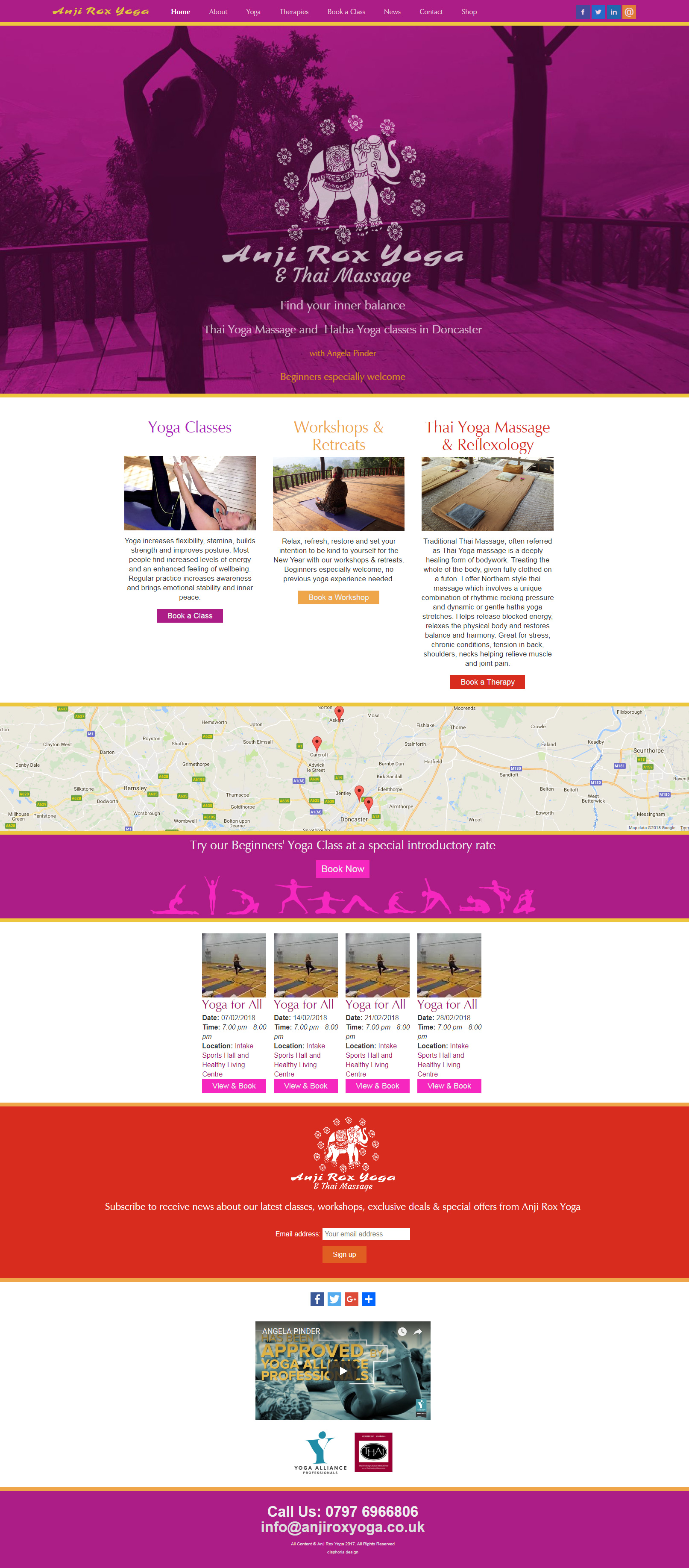
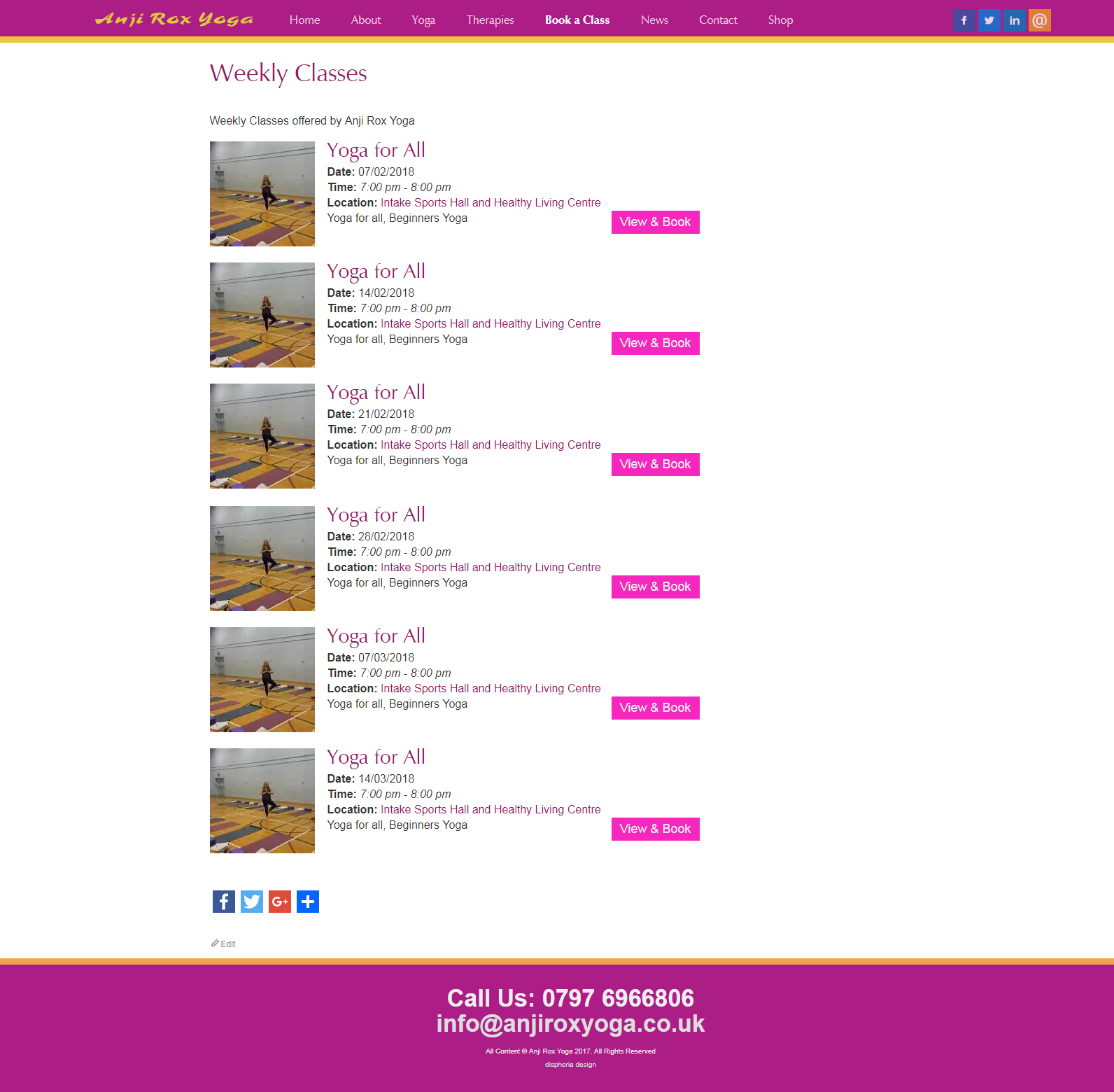
The purpose of the Anji Rox Yoga website is to enable people to book and pay for yoga and Thai yoga massage classes and workshops.
The Events Manager has lots of useful features, such as recurring events, Google maps of the locations, different ticket types, such as cheaper early-bird tickets and a wait-list for fully booked classes.
Automated emails are sent upon registration and payment for the classes.
Paypal is used as the payment gateway for ticket sales, so they can handle all credit card details safely.

The logo design was based on a Thai textile design bought by the yoga teacher when she was studying Thai yoga massage in Thailand, so it has personal significance for her, but is also unique and cheerful.
The design of the site follows the logo design with warm, friendly colours and less corporate-looking fonts in the titles, but keeping the design contemporary by having clean flat colours with plenty of white space to give a light and airy mood.
Visit anjiroxyoga.co.uk


St Patrick’s Roman Catholic Church in Corsham needed their website to display a large amount of essential information in a clear and easy to navigate format, that wouldn’t appear overwhelming to visitors.
The events section shows upcoming events in calendar format and also as lists, both with event details shown on rollover.

The large parish registers showing births, marriages and deaths are searchable and easy to update.
The most recent PDF of the Weekly Bulletin is shown automatically on the home page as a downloadable link.
The home page also displays the most recent news posts.
The logo design refers subtly to the Celtic cross, with a font that suggests both ancient and modern non-serif styles.